Here's what we're going to have built by the end of this tutorial:
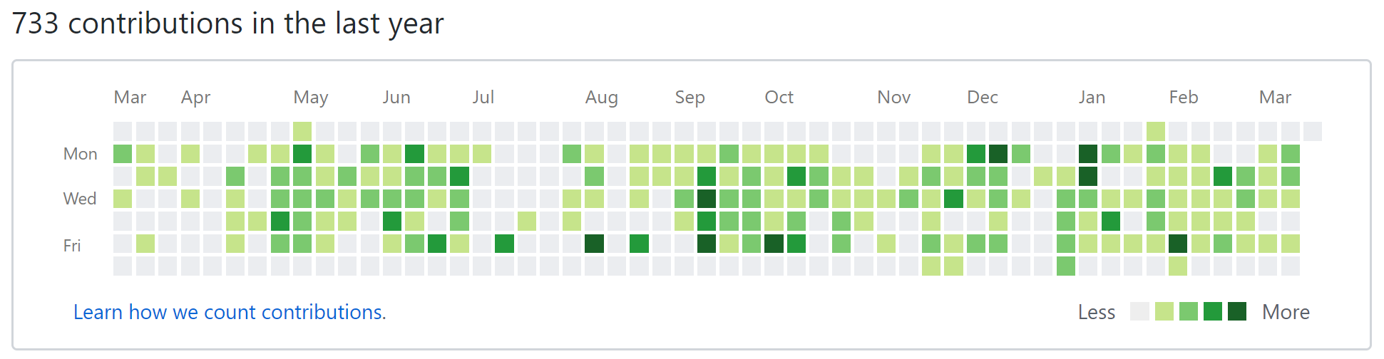
If you've never seen this chart, it's basically a heatmap of all your commits for code checked in on GitHub. You have the months going across the top, the days of the week going down the side, and each block represents a day. The darker the color, the more commits for that day.
There are plenty of ways to build what GitHub has (GitHub does it with SVG), but we'll build it with the new CSS layout tool, CSS grid. This tutorial will go over CSS grid basics and some neat tricks that utilize CSS grid's power.
If you're anxious and just want to see the finished code, check it out here on CodePen.
HTML
The first part is the markup. One caveat about CSS grid is that it forces you to "flatten" your HTML. Since display: subgrid isn't implemented yet, any items we want to position using grid must be siblings of one another.
Here's a sample of what I think makes most sense:
<div class="contributions">
  <div class="months">
    ...
  </div>
  <div class="days">
    ...
  </div>
  <div class="blocks">
    ...
  </div>
</div>
This would allow us to nicely separate the elements in the grid, but we lose a lot of control if we do that. So, instead, we're just going to have one parent element, .contributions and put everything inside that.
We'll need content for each of the months, each of the days of the week shown (just 3 in this case), and a single block for each day of the year minus one (yes, 364 div elements!). We're only using 364 since that's nicely divisible by 7. We'll start out with simple layout that looks like this:
<div class="contributions">
  <div class="spacer"></div>
  <div class="month">jan</div>
  <div class="month">feb</div>
  <div class="month">mar</div>
  <div class="month five-weeks">apr</div>
  <div class="month">may</div>
  <div class="month">jun</div>
  <div class="month five-weeks">jul</div>
  <div class="month">aug</div>
  <div class="month five-weeks">sep</div>
  <div class="month">oct</div>
  <div class="month">nov</div>
  <div class="month five-weeks">dec</div>
  <div class="day">mon</div>
  <div class="day">wed</div>
  <div class="day">fri</div>
  <div class="block"></div>
  ...
  <div class="block"></div>
</div>
Few things to note. I've added a .spacer element at the front that will work as the spacer in the upper left hand corner. I've added some classes to each of the elements so we can easily identify them. The .five-weeks is useful to identify the months that have 5 weeks instead of 4 so we can have them span 5 columns instead of just 4. And lastly, the .block elements. I've omitted the vast majority of the .block elements for brevity sake. To fill in the rest of them, if you're using Emmet (which you should be!), you can just type .block*364 and hit TAB to have it populate 364 div elements for you! Nifty.
While it doesn't look like much, this is all the content we're going to need to create our beautiful layout! Next, the fun stuff.
Layout
For this section, I'll be using Stylus, a CSS pre-processor. It essentially allows you to write CSS without curly braces, without colons, and allows things like nesting. It's not a must, but nice to have.
Making Rows and Columns
First thing's first, the grid! We apply display: grid to the .container element, but nothing happens. Why? We need to add some columns and rows! For the columns, we'll need a total of 53 (1 for the days of the week and 52 for each week of the year). For the rows, we'll need a total of 8 (1 for the months of the year and 7 for each day of the week). Here's how we can define that in CSS:
.contributions
  display grid
  grid-template-columns 50px repeat(52, 20px)
  grid-template-rows 30px repeat(7, 20px)
If you inspect the grid with your dev tools (I'll be using Firefox Developer Edition for its killer CSS grid features) and turn on outlines for your grid, you'll see we now have a nice table with 53 columns and 8 rows that looks something like this:
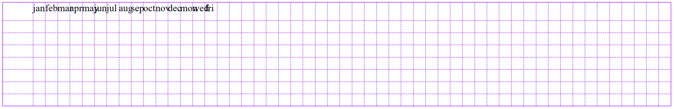
All the words are on top of one another, but we'll fix that in a minute. Let's talk about how we defined the columns and rows.
We defined the columns with grid-template-columns: 50px repeat(52, 20px). This tells the browser that we want some columns. The first column is going to be a static 50px wide. Then, we use the repeat() function which prevents us from having to type 20px 52 times. We defined the rows in a similar manner with grid-template-rows: 30px repeat(7, 20px). This means we want one row 30px tall and 7 rows 20px tall. You'll be able to see the extra tall first row and extra wide first column when inspecting the grid. This is to give us a bit of extra room for the labels. Now for the words!
Placing the Text
Let's stretch out the month labels a bit so that they're not all on top of one another. Here's the layout we'll use for the months:
.month
  grid-column-end span 4
  align-self center
Automagically, the browser spreads out our months across all of the rows, just like we need! The grid-column-end property defines where the cell in the grid should end. Instead of explicitly defining where the cell should end, we tell it to span 4 which means stretch the cell out 4 columns wide.
While this is great, not all months of the year have 4 weeks, some of them have 5. To solve that simple issue, remember that .five-weeks class we added to some months? That will come in handy to define which months need to be stretched across 5 columns instead of 4. Add the simple following snippet to handle this unique case:
.five-weeks
  grid-column-end span 5
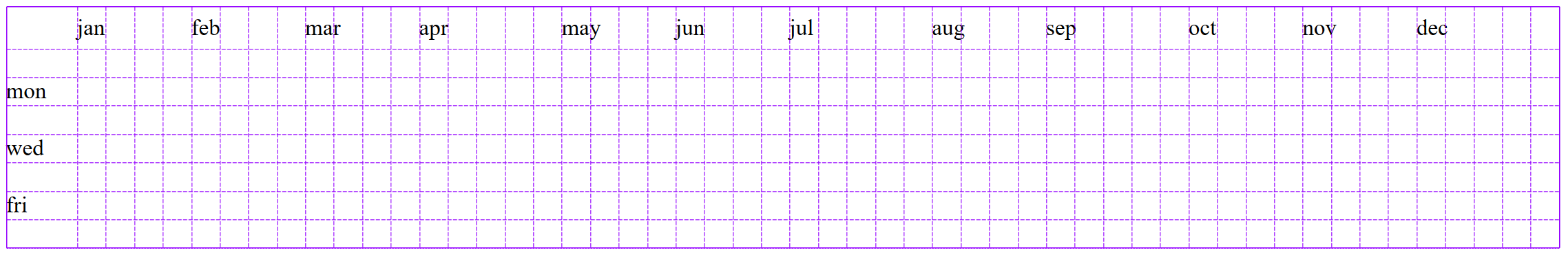
Now for the days of the week. We want to skip the first 2 rows. The first row is just a blank row reserved for the month labels, and since the weeks start with Sunday (in this case at least), we need to leave a gap for those. Also, we want to make sure the days stay in the first column.
.day
  grid-row-end span 2
  grid-column 1
Nice! However, we need a little bit of extra space at the top and start at row 2 and not row 1. There's plenty of ways to do this, but I recommend adding a .spacer at the beginning to fill that space. We can make it span 2 columns with:
.spacer
  grid-row 1 / span 2
We've got the basic shell at this point. It should look something like this:
Styling the Blocks
There are a few things we need to do to the blocks. We need to fill them in the grid, put some space between them, and color them. Let's start with the easiest part, coloring them.
.block
  background green
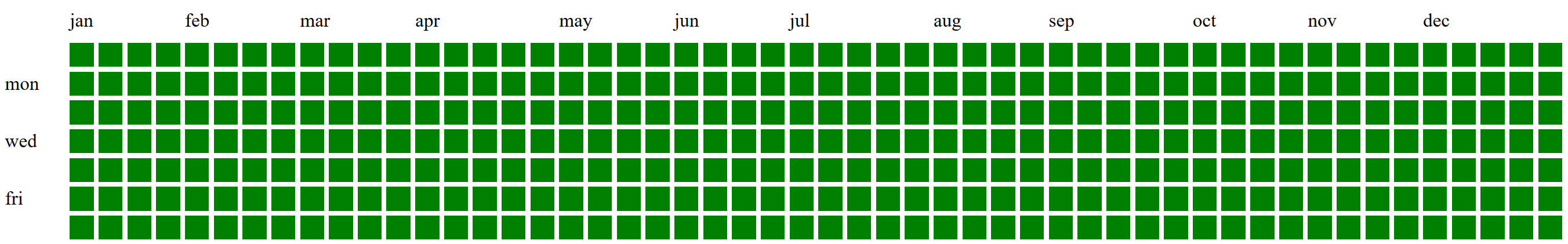
This causes some slightly unexpected behavior. What you get looks like the following:
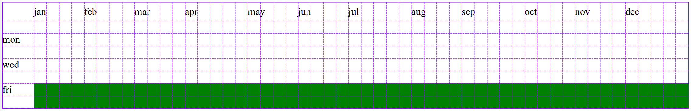
Instead of filling our grid in nicely in the empty cells, the browser starts at the very first cell that we haven't yet defined. Since we've defined items to go in the first 6 rows and the first column, it only has the last 2 rows to fill in the blocks! Fortunately, there's a neat feature of grid parent elements called grid-auto-flow that allows us to define how the browser fills in the cells. If we add grid-auto-flow: dense to the .contributions element, this tells the browser to fit in new elements as soon as it can. It's a confusing (but powerful) attribute so I'd recommending checking out the docs.
So all of our grid elements are filled in to the regions we want, but there's no spacing so it just looks like one big green rectangle. To fix that, let's add some gap between the cells with grid-gap: 4px on the .contributions element. Your .contributions element should now look like this:
.contributions
  display grid
  grid-template-columns 50px repeat(52, 20px)
  grid-template-rows 30px repeat(7, 20px)
  grid-auto-flow dense
  grid-gap 4px
and the output should look like this:
That's it for the grid aspects of the site! The rest will just be making it a bit prettier and closer to what GitHub has.
Few Little Details
There are a few things our layout is missing style-wise if we want to exactly match GitHub. Let's capitalize the letters, adjust the font and font color, add a border, and put some padding around the box. We can do that with the following statements:
.contributions
  text-transform capitalize
  font-family Helvetica
  color #767676
  border 1px solid #d1d5da
  border-radius 3px
  padding 8px
The last thing we need to do (well, we don't have to, but makes it look cooler) is add some colors other than the standard green. We could do this with CSS, but JavaScript will be easiest. It's just for demo purposes anyways, right?
Here's a basic way to do it:
// Create an array of the colors (from GitHub)
const colors = ['#eee', '#c6e48b', '#7bc96f', '#239a3b', '#196127']

// Iterate over all the blocks and assign a random color
document.querySelectorAll('.block').forEach(block => {
  const randomColor = colors[Math.floor(Math.random()*colors.length)];
  block.style.background = randomColor;
});
With this JS, we'll get an even random distribution of colors throughout the chart:
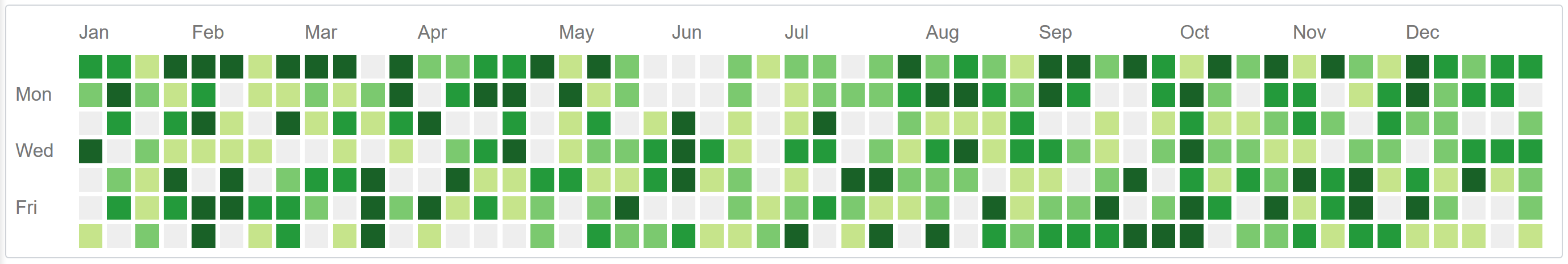
Looks good, but not very realistic. Is there really an equal distribution of "high commit" days and "low commit" days? Not really. To create a non-evenly distributed result set without getting nerdy with statistics, we can just "weight" the colors by adding more of them to the array of colors. Like this:
// Create an array to put the colors in
let colors = [];

// Create a bunch of different color arrays, each with different 'weights'
colors.push(Array(10).fill('#eee'));
colors.push(Array(4).fill('#c6e48b'));
colors.push(Array(2).fill('#7bc96f'));
colors.push(Array(2).fill('#239a3b'));
colors.push(Array(1).fill('#196127'));

// Flatten the array
const weightedColors = [].concat.apply([], colors)

// Iterate over all the blocks and assign a random color
document.querySelectorAll('.block').forEach(block => {
  const randomColor = weightedColors[Math.floor(Math.random()*weightedColors.length)];
  block.style.background = randomColor;
});
That looks a lot more realistic now! Here's the finished product:
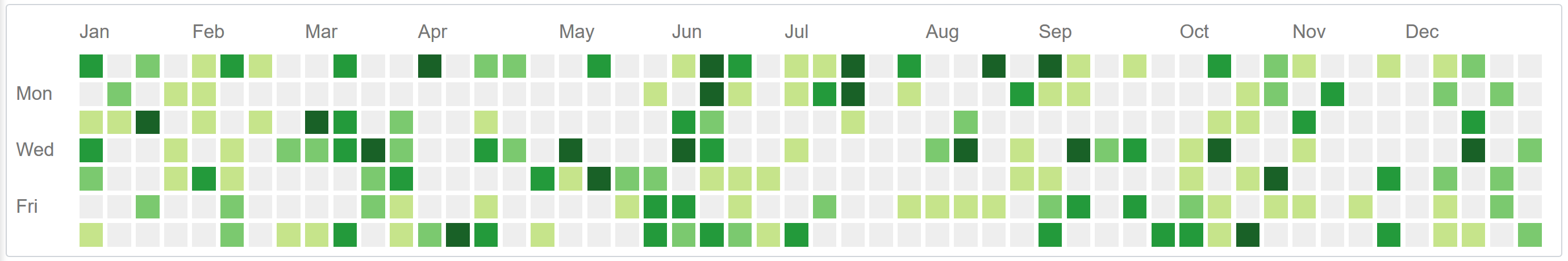
With just 22 lines of CSS (6 of which are extra styling), we have created a clean, simple representation of some interesting data.
This is just one of the many new ways to use CSS grid. If you have comments, questions, or issues with this tutorial, please leave a comment below and I'll get back to you!